The uncanny checklist: what gives AI video away
Short answer
AI video looks fake because of a small set of repeatable tells: hands, text, physics, cloth, liquid, lip-sync, eye lines, cuts that are too clean, lighting that does not match between shots, reflections, product geometry and audio that is too clean for the room. None of them is a mystery and each has a fix: regenerate, composite, shoot a plate, shorten the shot, cut away, or grade. A studio's job is to catch them on a phone screen before the viewer does.
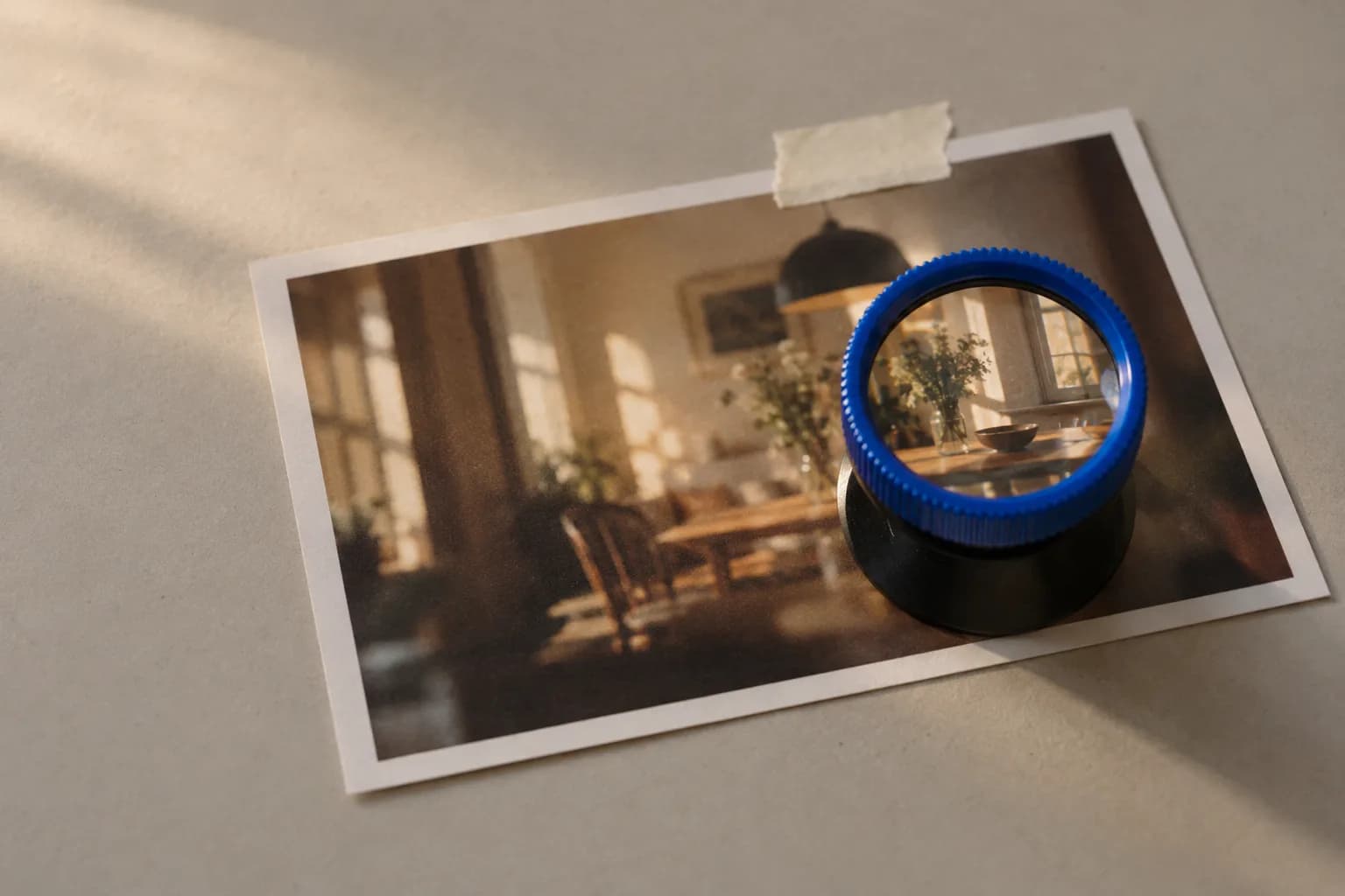
We watch dailies on the worst screen in the room first. A phone, brightness halfway, held at arm's length, sound on, in the daylight by the window. If a take survives that, it goes to the big monitor. If it does not, it never gets there.
The reason is that nobody watches your ad the way you watch your ad. They see it for a second and a half between a video of a dog and a message from their sister, and in that time something either reads as a person in a room or it does not. They will just scroll.
This post is the list we run before they do: twelve tells, what each looks like, and the fix for each without starting the shot again.
Why does AI video look fake?
AI video looks fake because the model predicts what pixels usually do, not what the physical world is doing in this particular shot. Where "usually" and "this shot" diverge, at fingers, letters, liquid, a face mid-sentence, you get an image that is plausible on average and wrong in detail. Human brains are extremely good at detail they never consciously look at.
Most of those detectors are old. We evolved to read faces, hands and moving bodies, so a mouth that is a frame late or a hand with the wrong number of knuckles trips an alarm that fires before language does. The viewer feels "off" and blames the product.
The second cause is additive. One tell might pass; five small ones in a three-second shot do not. That is why we check all twelve on every selected take rather than fixing the one somebody noticed.
The checklist: twelve tells and the fix for each
Here is the list we run on every selected take, in the order we check it. Each tell has at least one fix that is cheaper than regenerating the whole shot, and the first job is knowing which fix to reach for.
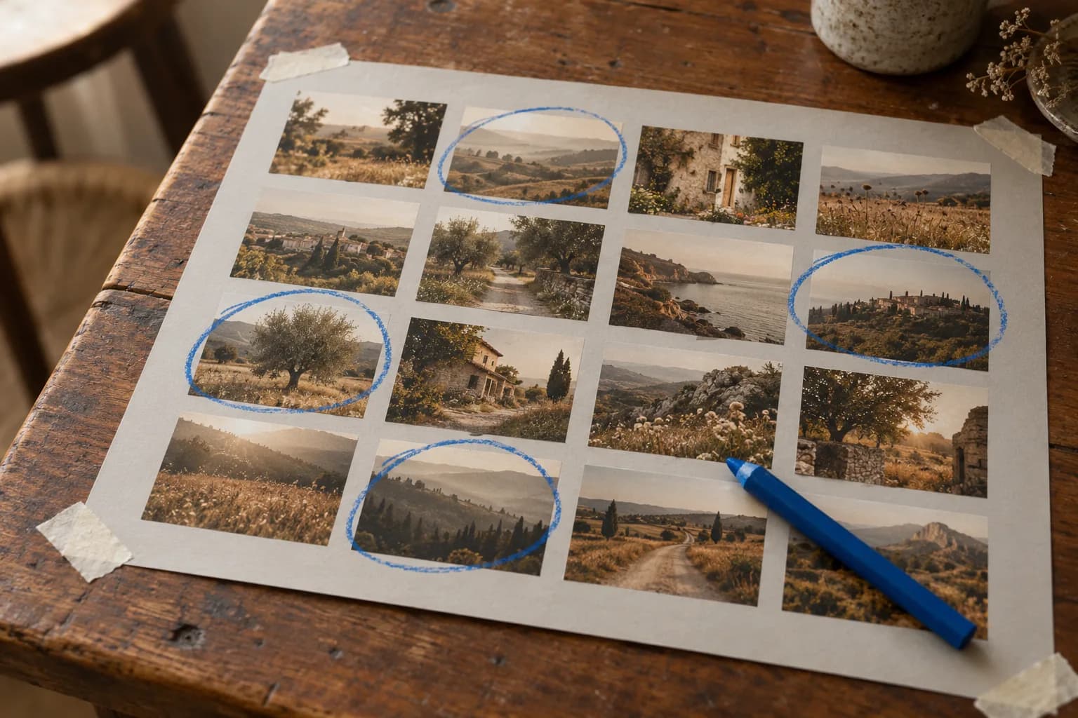
| Tell | What to look for | How we fix it |
|---|---|---|
| Hands | Finger count, a thumb on the wrong side, fingers that merge when they grip, nails that change length | Regenerate with the hand lower in frame or holding the product; composite a real hand; keep the hand on screen for under a second |
| Text | Labels, signs, screens, packaging. Letters that are almost words, kerning that breathes between frames | Composite the real label or packaging from a photographed plate; blur it with depth of field on purpose; frame it out |
| Physics | Objects that float a few millimetres, shadows that lag, a cup set down that does not quite touch the table | Cut before the object lands; cut away to the face at the contact moment; simplify the interaction and regenerate |
| Cloth | Sleeves that stay still while the arm moves, folds that reorganise themselves between frames | Cut the shot to under two seconds; keep the body still and move the camera instead; grade down the contrast on the fabric |
| Liquid | Pours that stop and start, foam without bubbles, a surface with no meniscus, a drop that travels upward | Plate the pour from a real shoot; show the result (the full glass) instead of the action; cut away during the pour |
| Lip-sync | Lips a frame late, teeth that change, a jaw that moves less than the voice implies | Keep on-camera lines under three seconds; cut to the product while the voice continues; record the voice with a real person so the timing has a truth to match |
| Eye lines | Eyes looking slightly past the lens, blinks too slow or too even, a gaze that does not track what the hands do | Pick takes where the eyes are busy with the product; regenerate with a defined look point; cut tight |
| Cuts too clean | Every shot starts and ends on a perfect frame; no breath, no settle, no overlap | Add a few frames of handle at head and tail; let a movement cross the cut; overlap the audio by a few frames |
| Lighting continuity | Key light from the left in shot one and the right in shot two, warmth that shifts, a window that moves | Lock key direction and colour temperature in the brief; grade all shots to one reference frame; reorder the cut so the drift reads as time passing |
| Reflections | Mirrors, lenses, glossy bottles, wet surfaces. The reflection shows a different room, or nothing at all | Frame reflective surfaces out or at an angle; composite a plate; soften the reflection in the grade |
| Product geometry | Cap height, shoulder shape, proportions that differ shot to shot, a logo that becomes a shape | Composite a photographed product plate; generate from a locked reference and seed; hold the product further from camera |
| Audio | A room with no room tone, a voice too close for the frame, footsteps that are not there | Record real room tone and lay it under; match the voice's reverb to the space; add the small sounds (a lid, a tap, a chair) by hand |
The list is in the order of how often each tell catches a take, not how much damage it does. Hands and text catch the most; product geometry and lip-sync do the most harm when they slip through, because they touch the two things the viewer is meant to trust.
On a normal day roughly one take in six survives the phone. The rest failed two rows of this table, and two is the threshold.
Which tells matter most for a brand?
For a brand, the product is the tell that matters most, then the face, then everything else. A viewer forgives a sleeve that behaves oddly; they do not forgive a bottle whose cap changes height between shots, or a logo that reads as alphabet soup. The product is the one thing in the frame the viewer is supposed to remember.
So we photograph the real product before generating anything, under the light the scene will use, and composite it in wherever the geometry or label is visible. It is the slowest step and the one I would not skip at any budget. Keeping that plate and the face identical across a whole set is its own post.
The face is second because faces carry trust. If the person is generated, the audience should be able to watch them for three seconds without the alarm going off: short lines, busy hands, eyes on the product. For UGC-style ads it also means a face with some history in it, not the generator's default.
How does a studio fix a shot without starting over?
Six moves, roughly in order of cost: regenerate, composite, plate, shorten, cut away, grade. Most fixes are the last three, because they cost minutes rather than hours and they are how editors have hidden problems for a century.
Regenerate is the obvious one and the most expensive, because the new take brings its own tells. We only regenerate when the problem is structural: wrong hand position, wrong interaction, a face that drifted.
Composite means taking the good part of one take and placing it in another. The hand from take four on the body from take seven. Works when the camera is still.
Plate means shooting the real thing, a product, a pour, a hand, and laying it in. Slower, but it brings truth into the frame, and truth is what the checklist is hunting for.
Shorten is the quiet workhorse. Nearly every tell gets worse with time on screen. A hand that is fine for a second grows a sixth finger by the third.
Cut away is the editor's oldest trick. The voice continues, the picture goes to the product, the problem never appears. It also makes the ad better, because it is pacing.
Grade covers lighting continuity and texture. Matching every shot to one reference frame hides drift in warmth and contrast, and pushing the whole thing toward a phone sensor hides the plastic skin that generators love. Which generators and upscalers we run for this, and why, is in our stack.
A fix pass on a flagged take is typically ten to twenty minutes. Regenerating until a take passes clean can be an hour with no guarantee. That arithmetic decides most of our afternoons.
The tell you catch on a phone at arm's length is the only one that counts, because that is where the viewer is.
Is AI video getting less fake?
Yes, unevenly. Hands and text have improved a great deal in the last year; liquid, long lip-sync and exact product fidelity have not kept pace, and I would not plan a project assuming they will by delivery. I expect to retire half of this table eventually.
What has not changed is the additive effect. Models improve one tell at a time and the viewer's alarm responds to the total, so the habit of checking every take on the worst screen in the room stays.
What to do with this list
Send it to whoever is making your video and ask to see their checks. A studio that has a QC pass will show you one; a studio that does not will talk about the model. Then watch the dailies on your own phone before you approve anything.
The work on the front page is what survives this list. If your problem is less "does it look fake" and more "does it look like our product every time", read the consistency post next.
Frequently asked
What is the most common tell in AI video?
Hands, followed by text. Fingers merge when they grip, a thumb ends up on the wrong side, and letters on labels or signs are almost words. Both are also the easiest to avoid by framing: keep hands low or holding the product, and keep text out of focus or composite the real label.
Can you make AI video that nobody can tell is AI?
For short shots with a still camera, a real product plate and no speaking, often yes on a phone screen. For a face talking for ten seconds in close-up, not reliably in 2026. The honest approach is to design the shot list around what holds up rather than hoping a single long take will.
Why do AI faces look slightly wrong even when they are attractive?
Because the model averages toward a median face with even skin, symmetric features and a frontal key light, and the human face-detection system reads that average as unfamiliar. Blink timing, eye lines that miss the lens and lips that land a frame late add to it. Specific, imperfect faces with short on-camera lines read as more real.
How does a studio check for these tells?
On the worst screen in the room first: a phone, at arm's length, sound on, in daylight. Every selected take goes through a fixed list in a fixed order, and anything that fails two items is fixed or dropped before the client sees it.
Got a product and a deadline? Fifteen minutes is usually enough to tell you whether AI is the right way to make it, and what it would cost.
Book a callor look at the work